Creating a MacOS help button in SwiftUI
When using SwiftUI it's not at all uncommon still to run into incomplete implementations, where you just need to roll your own even for system standard components. Latest I ran into this today, when trying to implement the circular question mark button for the help functionality that the MacOS user guidelines direct to use.
This button however didn't have an implementation in SwiftUI so I built it myself as close as possible. This implementation respects the system light/dark setting as it uses the NSColor default colors.
Here's the class implementation:
struct HelpButton: View {
    var action : () -> Void

    var body: some View {
        Button(action: action, label: {
            ZStack {
                Circle()
                    .strokeBorder(Color(NSColor.controlShadowColor), lineWidth: 0.5)
                    .background(Circle().foregroundColor(Color(NSColor.controlColor)))
                    .shadow(color: Color(NSColor.controlShadowColor).opacity(0.3), radius: 1)
                    .frame(width: 20, height: 20)
                Text("?").font(.system(size: 15, weight: .medium ))
            }
        })
        .buttonStyle(PlainButtonStyle())
    }
}
and associated Preview:
struct HelpButton_Previews: PreviewProvider {
    static var previews: some View {
        Group {
            HelpButton(action: {}).padding()
            if #available(OSX 11.0, *) {
                HelpButton(action: {}).padding().preferredColorScheme(.dark)
            }
        }
    }
}
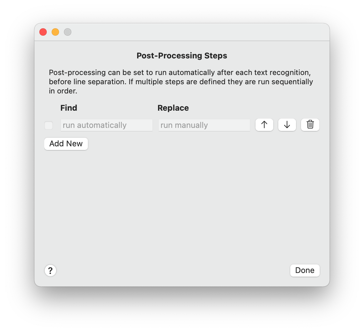
And the result looks like this (note in lower-left hand corner) in OwlOCR :

